Ten Clever Yet Minimal Banner Ad Designs
Banner ads are everywhere. However, we're so used to being bombarded with advertising in the modern world that the vast majority of banner advertisements are unlikely to make much of an impression on us, even if they are one of the biggest and boldest ways to advertise.
However, there are a handful of businesses that are using banner printing as a base for some of the most creative marketing out there.
The trick with banner ads is to keep things simple. So, if you're thinking of getting involved in banner printing for your business, take a look at the list below and get some inspiration. In our opinion, these are some of the most creative (yet minimalistic) banner ad designs ever.
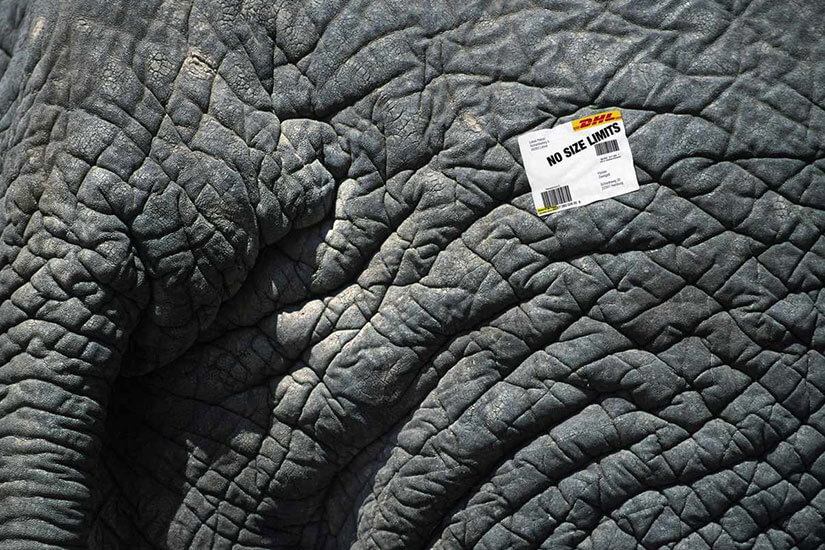
DHL: No Size, No Limits.
We absolutely love this banner from DHL (one of the world's largest mailing/delivery companies) as it's so simple yet so eye-catching.
At first, you might wonder what the banner is all about, but if you look closely, you'll notice the sticker on the side of the elephant in the image. It reads "No size limits".
This banner was created to promote DHL's lack of a package size restriction, a useful, unique selling point within the industry.
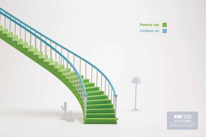
Hospital Aleman: Stairs.
I know what you're thinking, it's not very often you see a banner ad for a hospital, let alone an exceptionally creative one. But as you can see, this is a great ad.
The ad highlights the somewhat non-accidental difference of interpretation that quite often takes place between parents and children. It's simple but very effective and also amusing.
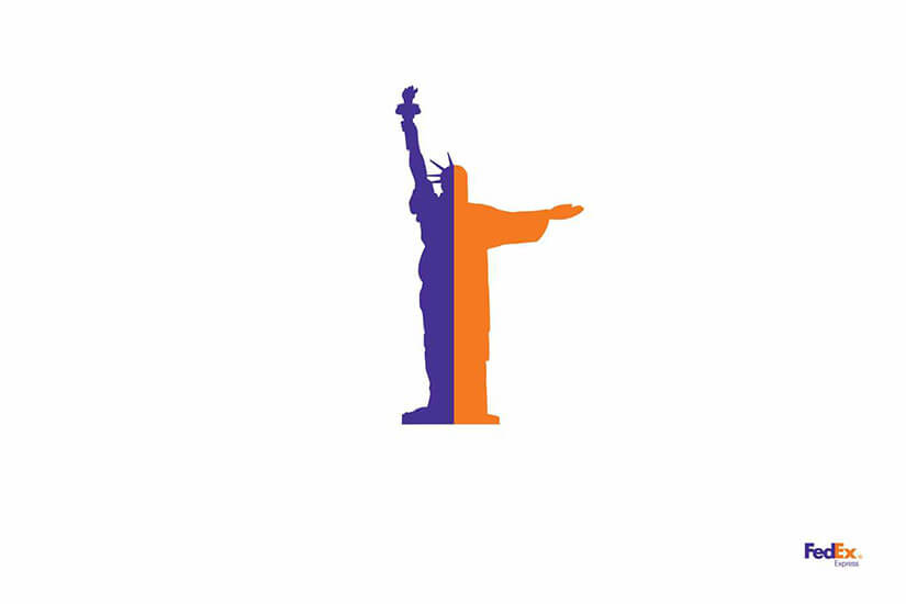
FedEx: Status Of Sugarloaf.
FedEx is another one of the world's biggest and most well-known mailing companies, and this ad is exceptionally minimalistic, yet also incredibly creative.
As you can see, the ad uses the FedEx colors to create a Statue of Liberty/Christ the Redeemer combination, highlighting the speedy delivery that FedEx offers around the world.
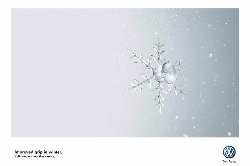
Volkswagen Snow Tires: Crystal.
Volkswagen is a well-known car manufacturer with a unique selling point: some of its models are fitted with snow tires that have extra grip in the winter.
The ad depicts a snowflake gripping onto the windscreen of a car in the winter. It's a simple, eye-catching image that manages to explain the unique selling point with very few words.
Bosch Electric Screwdriver: Fly.
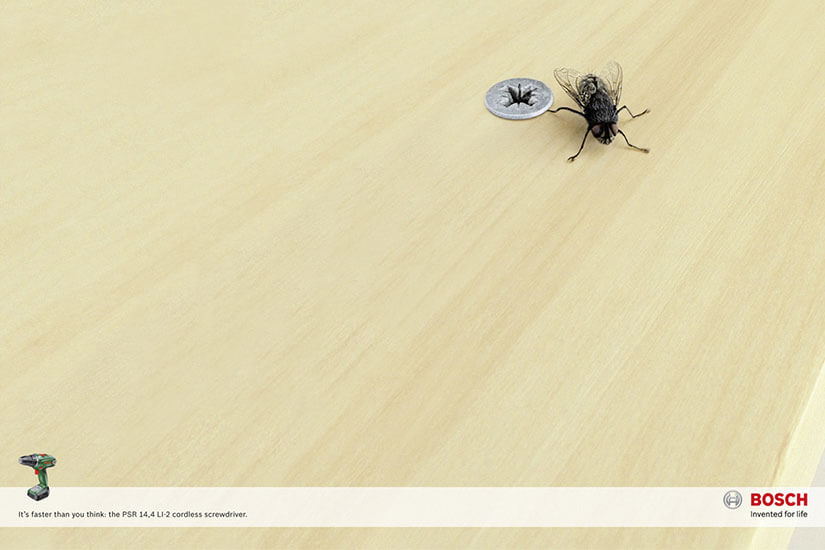
There are a lot of electric screwdrivers on the market, and one of them is produced by Bosch, a well-known electronics manufacturer. Bosch has managed to use creativity and minimalism to create a fantastic ad that highlights the unique selling point of their product: the speed of the screwdriver. To highlight this, they've depicted a fly with its leg trapped in a screw. It seems the drill was so fast, the fly didn't even have time to get away.
Olay: Undo.
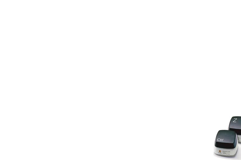
This ad from Olay is perhaps the most minimalistic banner ad on our list, but it's certainly no less clever. In fact, it might be the cleverest of them all, as it manages to say so much without a single word.
Anti-aging products are popular all around the world and produce a lot of revenue for companies like Olay. This banner ad from the company uses the keyboard keys "CTRL and Z" to advertise their product.
Why these keys? Clicking these keys on your computer will undo the last thing you did. The idea is that their product will "undo the process of aging. Very clever indeed.
Nori: Japanese Food From 11 am.
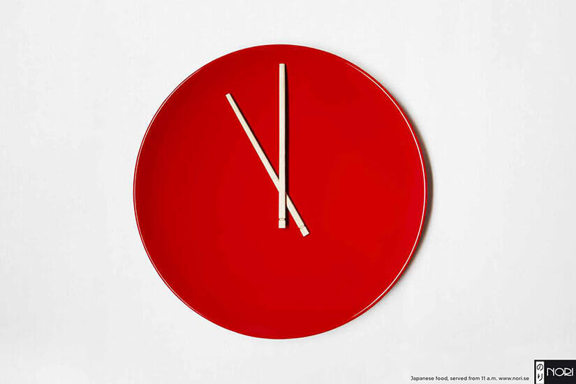
Nori is a Japanese restaurant with a unique selling point based on their opening times. They serve Japanese cuisine from 11 am, much earlier than a lot of other Japanese restaurants. The thing is, this is a pretty boring fact, so how do you grab the customers' attention enough to let them know?
Print a creative banner ad, that's how! As you can see, this ad depicts a plate along with a couple of chopsticks to create what appears to be a clock showing the time 11 am. The red plate really draws you in, and although the banner is minimalistic, it's extremely smart as it says so much without really saying anything at all.
LA Bicycle: Folding Bike.
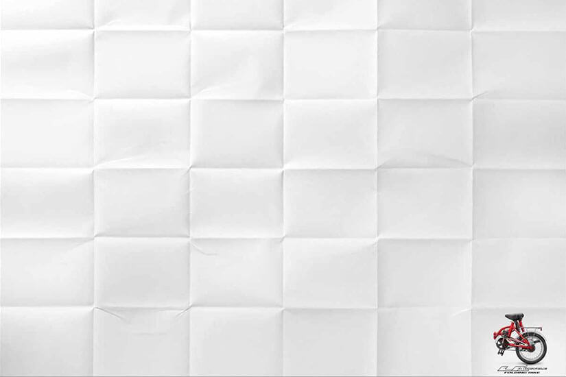
LA Bicycle has a unique product: a bike that folds up into a small portable version of itself. The aim of this is to make traveling with the bike easier than ever.
LA Bicycle decided to opt for a printed banner ad that depicted a folded piece of paper with the folded version of the bike in the corner. There are no words on the ad at all, but the image itself does all the talking.
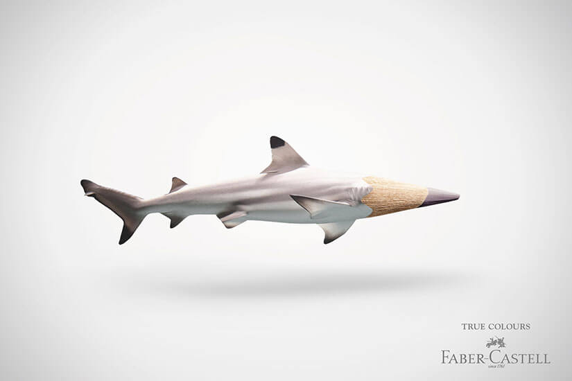
Faber-Castell: Shark.
Faber-Castell produces some of the most true-to-life drawing materials on the planet, but in a swamped marketplace, this unique selling point can easily get lost in the crowd. Luckily, Faber-Castell has creativity on its side, and so, to market their products, it produced a range of minimalistic banner ads like the one above.
The one in the image above is clearly a shark crossed with a pencil. The idea is to show just how true-to-life their colors are.
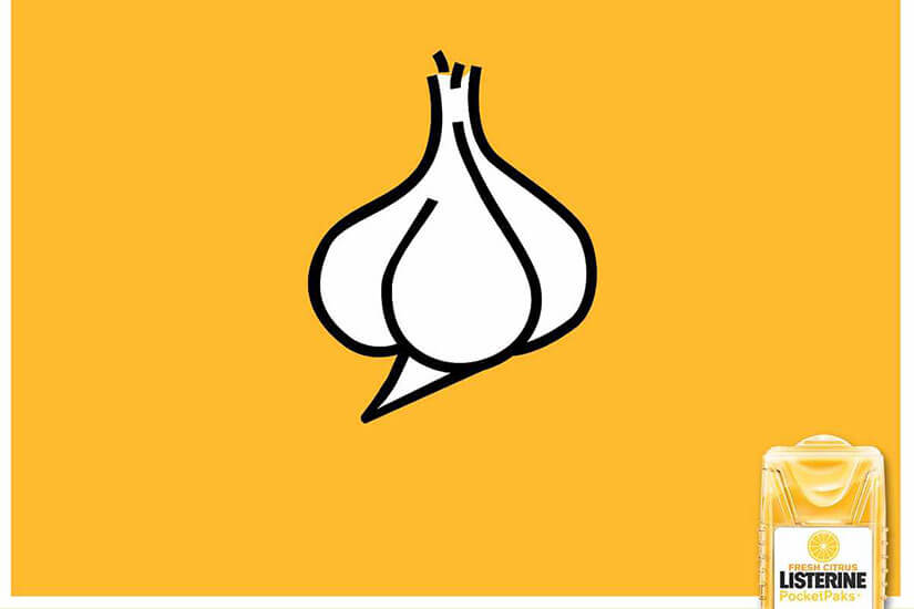
Listerine: Garlic.
Listerine produces a range of oral hygiene products in a market that is saturated with other, sometimes lower-cost alternatives.
To keep their name fresh in the consumer's mind, Listerine produced a series of bright and colorful banner ads depicting common nuisances in the world of oral hygiene, like garlic, fish, coffee, etc., to remind people to think of Listerine when they need to freshen their breath.
Additional Details
