Usability Trough
When I'm talking to people here in Northwest Arkansas about new technologies, a statement I frequently hear is, "Oh, I'd never be able to use that! It would be way too complicated for me!" While it's easy to write that off as technophobia or irrational recalcitrance, that hasn't been my observation. These are generally not people who are afraid of new things, and I don't think there's anything irrational about their reaction. I think it's a perfectly natural response based on their past experience, but it can tell us something instructive about vision and design.
Consider the evolution of mobile phones. Twenty years ago, cell phones were relatively simple devices. They were shaped more or less like traditional telephones, with the usual 10 number buttons plus # and *, and with the exception of "dialing" by hitting the SEND button and "hanging up" by hitting END, they worked about the same. All they did was make calls, and they were pretty good at it. The screens were basic black and gray LCDs with just enough characters to display a 10 character phone number. Anyone who had used a telephone since about 1920 could've figured it out with little difficulty.
The first change was the addition of some saved speed dial numbers. Usually, you'd do something like holding down the SAVE button until it prompted you to press a number (1-10) to store the number, then you'd enter the number and hit SAVE again. You could then call that number just by pressing the number button and hitting send. It was a little more complex, but the usability hadn't suffered much.
It was up to you to remember which number was whose, though, so the next obvious solution was to let you enter a name to go with it. Now remember how much trouble that was when using the alphanumeric keys to select each letter one by one. For example, my name would've been 777-999-2-66-1-9-33-555-555-7777. I don't even have a very long name, and it took 23 key presses. That's just a ridiculous way to enter text, yet it was accepted as "normal" by millions and millions of people.
The next development in cell phones was bigger screens with some basic features, such as contact lists, but consider what the experience was like. Here are typical instructions to enter a contact (paraphrased from an actual cell phone manual, circa 1998):
- Press the MENU button
- Press 4 for the Contacts option
- Press 2 to edit your contacts
- Press 1 to add a new contact
- Use the up and down keys to move between name and number fields
- Enter a first name, last name, and nickname (all using the laborious multi-press alphanumeric input options, so probably 40-50 key presses)
- Enter a phone number
- Press the END button to save your changes
- Oops, that should have been the SAVE button! Sorry! END canceled the new contact instead and took you back to the main menu
- Start over at step 1, then press SAVE at step 8 instead.
Given that experience, it shouldn't come as a shock that instead many people chose to scroll through their recent calls to find frequently used numbers…or they just ignored their phone's features altogether, memorizing and manually dialing numbers each time like the old days. I know more than a few people who just carried around old style pocket address books instead.
That is a catastrophically broken user experience!
Yet again, it was accepted as normal by practically everyone.
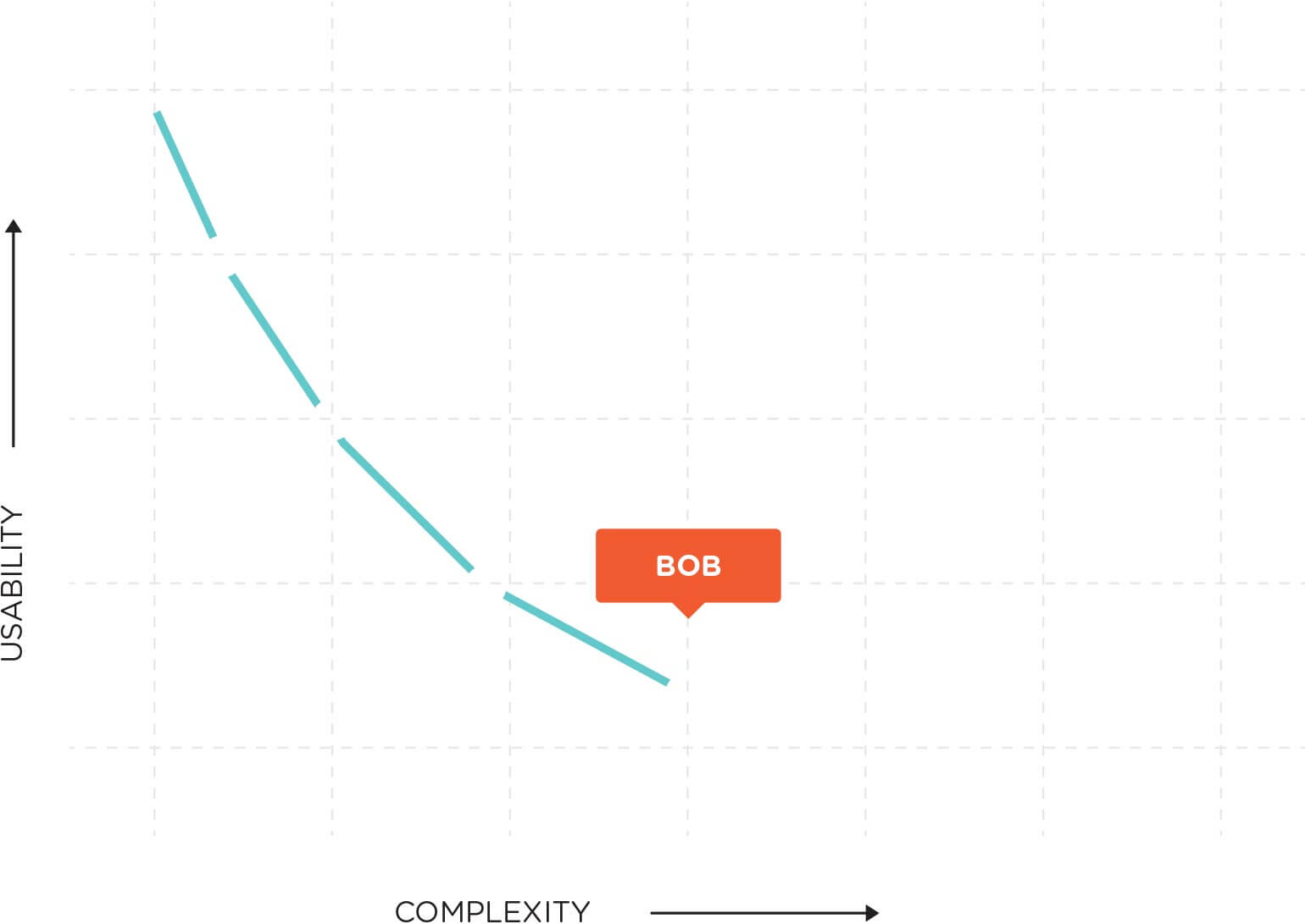
Now, think of a hypothetical cell phone user. Let's call him Bob. Bob bought his first cell phone in 1993, back when they came in satchels and had power bricks that were, literally, the size and weight of a brick. It was simple, and Bob understood how to use his phone very well. No problem at all! Bob got his next phone in 1998. It was a handheld that would fit in his pocket (his coat pocket, anyway), and had a bigger screen on it. It was more complicated and was harder to use, but after some effort and time, he was able to use it pretty well.
Bob's next major phone upgrade came around 2003. It had even more features, including a basic web "browser" and a small camera. Bob tried, but he never really got the hang of it. He used the features that carried over from his previous phone, but most of the new features were too much trouble. The web browser was tiny and slow. The camera was grainy and blurry, and he could never figure out how to do anything with the pictures. The menu screen now had fifteen options spread across six submenus. After a few years, he was able to navigate through about a third of the features.
A few years later, in about 2007, Bob got another new phone. The screen had gotten larger, the menus had expanded, and the features had increased significantly. This phone could now do a lot more than his older phones… and yet….
The contact system stored more information than ever before, but it had gotten even harder to use. The menus were slow and took forever to navigate. Just changing ringtones required going through five menus. Bob's phone had a music player now, but it was so complicated that Bob never really used it. It could handle email, but typing anything more than a few words using the alphanumeric keypad was the stuff of nightmares!
Finally, around the release of the first iPhone, smartphones started making significant improvements in ease and usability, but Bob isn't interested. He's done!
Based on his experience, that's a perfectly rational decision. For twenty years, ever successive phone he's used has had more features, but it has also been more complex, harder to use, and expensive than the previous version. Why should he pay even more money for a phone that's even more complex, if it's just going to be correspondingly harder to use? The technology train is rolling down the tracks, but Bob got off at the last station, and he's not getting back on.
Bob's experience is that usability always diminishes with complexity, as in this chart:
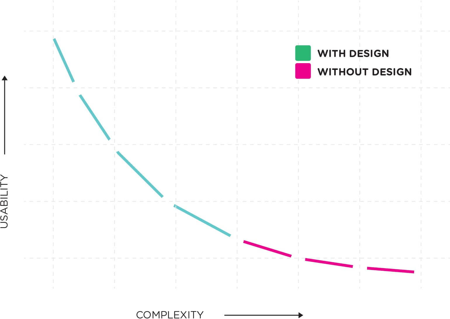
Bob hasn't seen the big picture, though, and the story doesn't end there! Eventually, given careful, thoughtful design, increased complexity can lead to greater usability and simplicity:
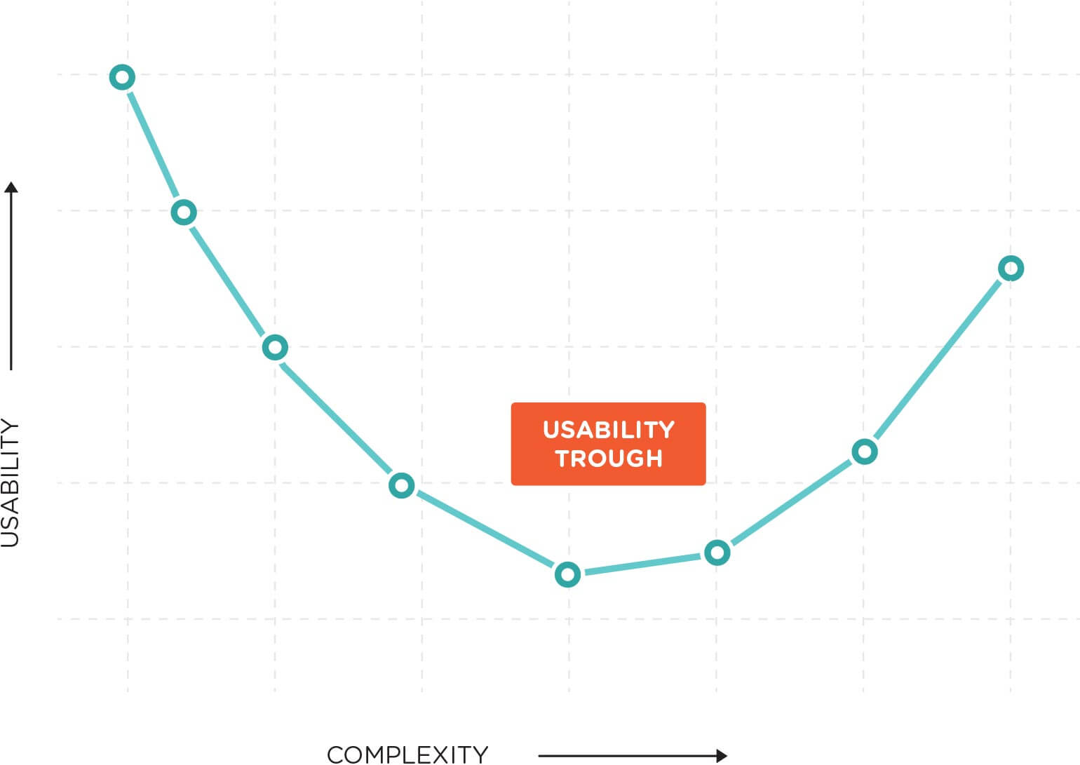
That low point, right before the situation starts to improve, is the Usability Trough, and sadly, Bob has gotten caught in it. That's easy to do if, like Bob, we don't look ahead and see the big picture.
Consider voice mail. Remember the old dial-in-to-listen, keypad-controlled voice mail systems, and all the effort required to listen to messages? Now, compare that to a modern visual voice mail inbox. Voicemail in 2013 is significantly more complex than voice mail in 1998, but few people would argue that modern voice mail isn't dramatically easier to use.
Great cameras, improved contact management, usable web browsers, real (or virtual) keyboards, good email — even though they're several orders of magnitude more complex than phones from a decade ago, new smartphones are also far more usable.
This pattern has played out again and again. Think of how many VCRs you've seen blinking 12:00 and how many people couldn't program theirs to record anything. A DVR is far more complex than a VCR, but how many have you ever seen blinking 12:00? How much easier is it to set a single DVR recording than a VCR, let alone a recurring one? The recording is handled through easy on-screen menus, and they set their own clocks.
DVRs are moving up out of the trough, along with Rokus and AppleTVs, yet I know people who are reluctant to make the transition because their experience with video players over the past three decades has only been on the downward slope of the usability curve. If they'd only go a little further, their experience would start improving, but they've been conditioned to expect worsening experiences, and they're avoiding that pain in the easiest way they can.
Televisions, home appliances, computers, game systems, even cars — they're all at various points along the usability-complexity curve, and some of them have yet to start clawing their way up out of the depths of the Usability Trough. We need only have faith that eventually we'll emerge from the trough into a bright new future!
There is an implicit assumption in my techno-optimism, though. You probably caught it a few paragraphs back:
Careful, thoughtful design!
Without that crucial factor, the usability curve will continue sloping downward unabated. The full chart looks like this:
We see this most often in internal business applications that have been expanded and maintained piecemeal over many years by numerous and frequently-changing teams. They seldom have anyone responsible for their overall design, and so they evolve into complex amalgamations of incoherent screens covered with dozens of poorly arranged, disorganized buttons and boxes.
That sort of software tool isn't only exasperating and inefficient to use, it's actively unpleasant. And life is too short to use unpleasant tools!
That's why good design is important, and why it deserves attention and consideration — because it makes people's lives better! That's the message Apple's Designed in California ad is trying to convey. That's the responsibility that we programmers, designers, and other technologists owe to those who depend on us, and why we should make it our mission to use our skills and knowledge to build good things.
Not only that, but we owe it to them to share our vision of a better world on the other side of the Trough, to give people hope and an expectation for better experiences in the future.
Good design can't prevent the Usability Trough entirely, but it can make the Trough shallower and its sides less steep. Most importantly, it can make people's lives better, because who wants to live in a trough?
Author
- Ryan Wells
Related