Apple iOS7 TextKit
Unless you've been vacationing in a cave (or living a strange, hermetic Android-only lifestyle), you're aware by now that iOS 7 has landed on nearly all of Apple's iDevices. The new bright, flat, animated and layered UI design has garnered the most attention so far, but I want to draw attention to an addition that could be just as important for designers: TextKit.
Typography has always been important to Apple's culture, even predating the company itself by capturing the imagination of Steve Jobs during his college days. With iOS 7, Apple is reminding again us of the primacy of written text in user interfaces by placing it front and center in much of their new design.
TextKit gives developers and designers easier access than ever to advanced text layout and styling options. Prior to TextKit, there were really only two options for really nice text layout: CoreText and Webkit.
CoreText is an advanced Unicode layout engine, with all of the power and complexity that implies. It lies at the heart of practically all text rendering in iOS and OS X. Webkit is, of course, just a web view that renders your text the same way you're accustomed to in browsers, and embedding a web view into an app is one way to easily control text appearance.
The goal of TextKit is to provide native applications a way to control the text that is easier than CoreText and more reliable than WebKit. The great news for old-school designers is that now is the time to dust off all your typography textbooks and get ready to apply those skills to all your new apps!
Among the classic typography features that are now easy (or at least easier) to use in TextKit are kerning and ligatures (search for "Font Descriptors" to learn more about these), but the advanced features extend into interactive coloring, custom truncation, folding, columns, text flow, and other dynamic features. I would encourage you to look up some of Apple's excellent videos on the subject from WWDC 2013.
The feature that perhaps offers the greatest challenge for designers, though, is Dynamic Type.
A full tutorial is outside the scope of this article, but there are a few aspects you should be aware of in order to have an idea of what to look for when you're digging deeper.
The first thing to be aware of is that iOS 7 allows users greater control over text sizes across the entire OS. This is a real boon for users, especially those with special needs, and users will likely soon come to expect most apps to support changing text sizes. This could be a potential headache for designers, though.
Imagine that you have carefully laid-out your text label, and it finally looks just the way you want it to: 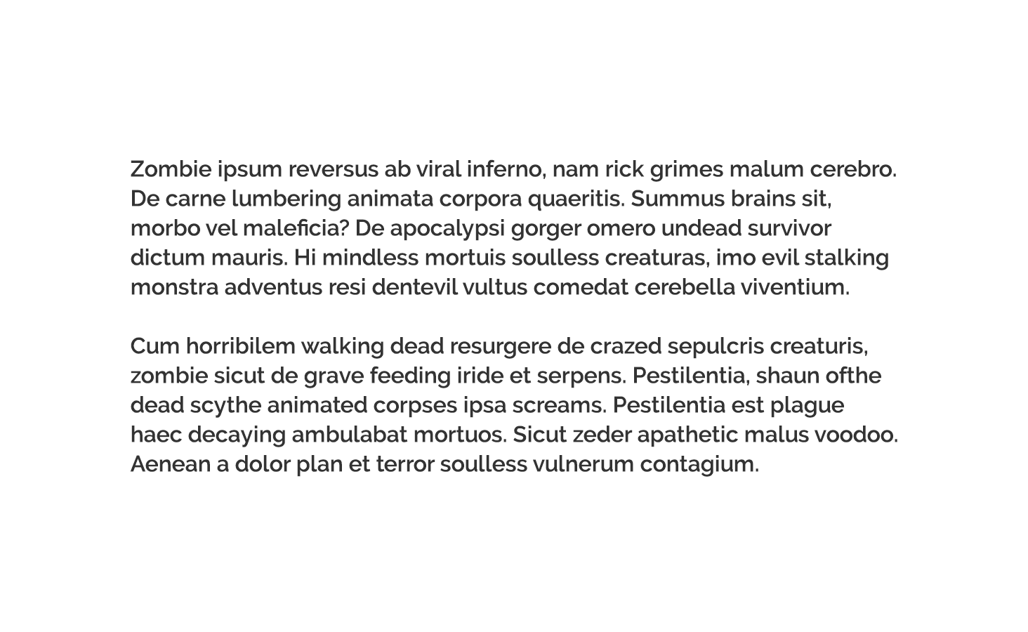
Everything is great until you run your app on your grandmother's iPad, and suddenly what you see is this: 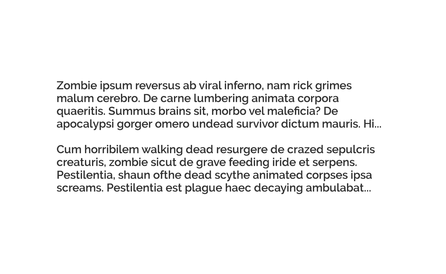
Panicked, you grab a test device and load it up only to find this: 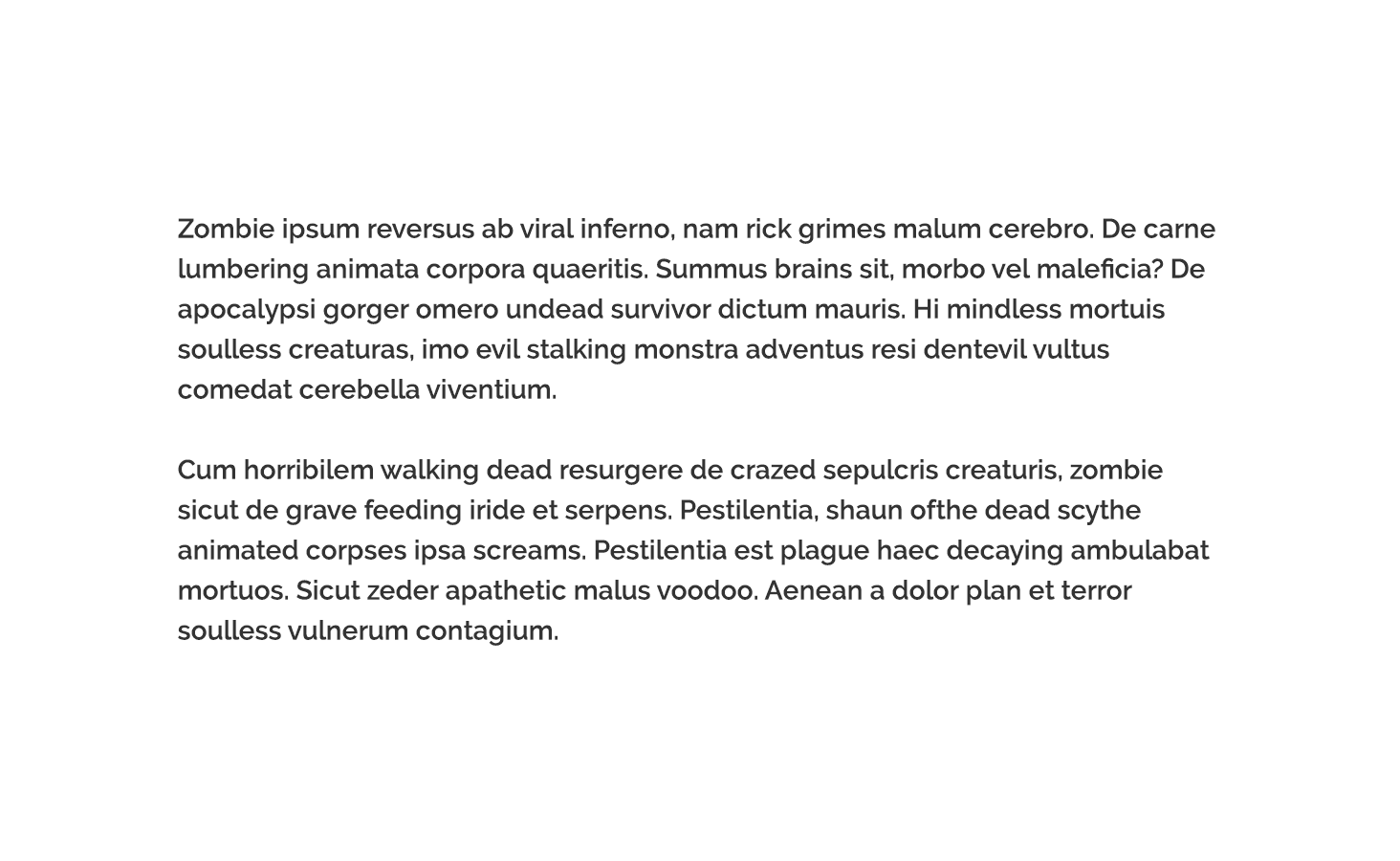
What's going on?!
The problem is that your app while supporting Dynamic Type, is not really responding to it. All three devices have different text size settings (look in Settings – General – Text Size). If you have interface elements that heavily rely on text, you should not expect them to always look exactly the same across devices.
The first part of the two-part solution to this problem is to use Text Styles and Variants instead of explicitly specifying typefaces and fonts as we're accustomed to doing. Using this approach, you are effectively describing the attributes you want your text to have, then relying on the system to provide a font that meets those requirements. This will allow your application to give users the reading experience they want and expect while maintaining visual consistency across the OS.
The second part of the solution is to use Auto Layout as much as possible so that your app controls can shift and move as needed. As you could see in the examples above, the sizes of the labels needed to change to fit the text, and their relative positions needed to shift to accommodate those changes.
A great way to see these principles in action is by observing changes in the Notes app (both in a note and in the list of your notes) while changing your text size. Notice how not only the text sizes change, but also the spacing, weights, and layout. This is the type of responsive experience your users will increasingly expect.
Adopting these techniques can also pay dividends when translating your applications to other languages since they make it easier to adapt to differences in character sets and word lengths.
The field of print typographic is deep and rich, and by bringing more of those traditional concepts and methods to iOS and OS X, TextKit is taking a giant stride toward offering that depth to app designers. Just as great graphic design became an important differentiator with the launch of iOS 1, a great typographic design is emerging as a key differentiator in iOS 7 and beyond.
It can be a daunting topic, but your effort to learn about and master the basics will be richly rewarded.
Author
- Ryan Wells
Related