Seafood At Home Landing Page Design
Seafood at Home approached Doc4 in an effort to branch out by testing the waters with local design agencies.
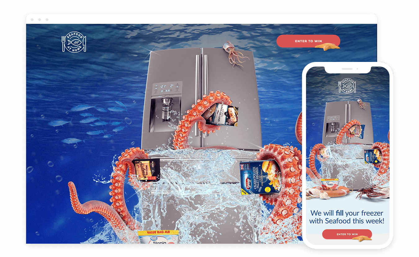
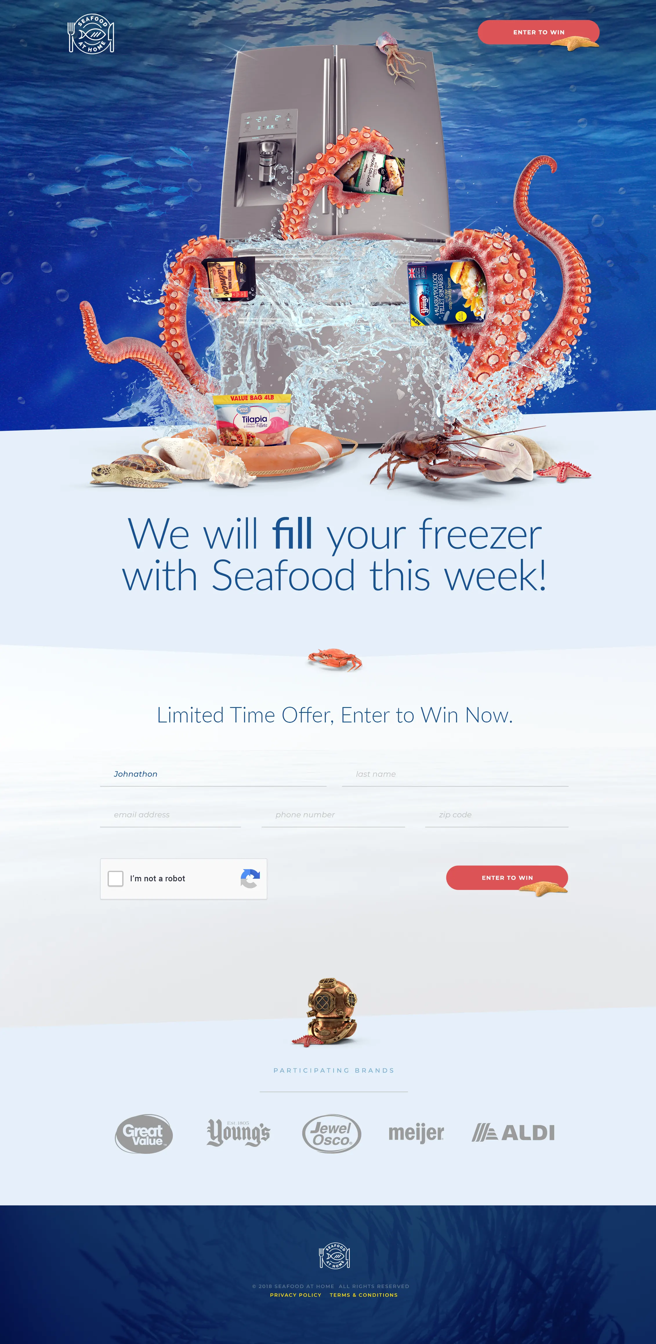
In this particular instance we were given a very loose project requirements sheet focused on high level points such as "make it big" and "eye-catching". We decided to take this to the next level and really showcase our skills. Starting with a simple refrigerator shot expanded on through Photoshop to include myriad seafood elements, products, exploding water elements, and so much more. The concept was accepted with open arms and immense excitement. The campaign culminated with Doc4 designing and developing a contest landing page website featuring the design pictured here.
This was by far one of our favorite projects followed closely by our Freightliner website design concept.
Visit WebsiteServices
- Graphic Design
- Website Design

